Spring 2021 🌸 🌷
Summary
This release continues our journey towards even more flexible components for developers. Angular Masthead and React Inputs are now compositional, and Autocomplete is now available for Angular packages. There are also various bug and accessibility fixes.
❗️ This is a very large, breaking release.
Allocate Dev and Design time accordingly and refer to the Upgrade Guide at the bottom of these release notes for project scope. The largest effort updates are Angular Masthead and React inputs.
Package Versions
- Angular: 13.0.0 -> 14.0.0
- React: 5.0.0 -> 6.0.0
- Spark (HTML): 16.0.0 -> 17.0.0
- Styles: 2.0.0 -> 3.0.0
Documentation
Spark Styles
Masthead
- Reduced size of content padding.
- Added use of wide variable to the Type Display One styles (
$sprk-font-size-display-one-wide).
HTML
Inputs
- Modified Input stories to provide better support for screen readers and other assistive technology.
Footer
- Footer text that need an inline link can use
sprk-b-Link--inline-lightfor the appropriate styling on dark background. This is reserved for footer for now.
Angular
Autocomplete
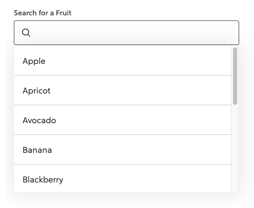
The Spark Autocomplete component is now available in spark-angular. This component can be used to help users filter and select from a list of options. For examples on how to configure and use Autocomplete, refer to our kitchen-sink repo (search for "autocomplete" to find the examples).
Masthead
- Updated the Masthead to be compositional. ❗️ This is a breaking change.
- Added the ability to have a Masthead without a collapsible nav on small screens.
- Added two new stories for Masthead that show it without the collapsible nav and show it with an example page so the scrolling functionality is viewable.
- Updated the Masthead Accordion to use
headinginstead oftitlefor the prop name since title causes an a11y error. - Added ability to pass in an
aria-labelto the Masthead Accordion. - Improved a11y of Masthead collapsible navigation button by adding
focusable="false"to the SVG Icon. - Added output event to the collapsible navigation button.
- Fixed an issue in Angular 11 where our use of HostBinding in directives needed a property name. Thank you @jtneal for your contribution! #3979
Inputs
- Modified Input stories to provide better support for screen readers and other assistive technology.
sprk-icon
- Added a new
ariaHiddenInput. The value of thisInputwill be applied to thearia-hiddenattribute on thesvgelement. - Added a new slot to the footer for
additional-disclaimer-slotthat allows for content projection.
Stack
- Added a new input for
isStackItemthat will apply the stack item class if set totrue. - Added a new
splitAtvalue ofextraTinyto match thesplit@xxsbreakpoint.
Tooltip
- Added
verticalAlignmentoptions.
React
- Updated the Inputs API and is now more compositional. This is a breaking change.
- Forwarded refs are now available
Tooltip
- Added
verticalAlignmentoptions.
🎒Upgrade Guide
ALL PACKAGES (Angular, React, HTML)
Angular Upgrade Guide
- Inputs
- Find any decorative
sprk-iconcomponents inside ofsprkFieldErrorand add aariaHidden="true". You'll typically found in invalid input states. - Remove
hasIcon="true"fromlabelelements on inputs - Phone: change from
type="text"totype="tel"
- Find any decorative
- Masthead: To give developers and apps flexibility, we converted this into a compositional component. Refer to the Masthead Storybook code to refactor your Masthead.
📍This is a large refactor and could take come time, allocate this effort into your sprint accordingly
React Upgrade Guide
Spark Inputs are now compositional to give developers more flexibility.
Legacy inputs are still available, but will be removed at the next major release.
Refer to the Storybook Inputs for updated code samples.
📍Because of amount of work this takes to refactor every input, we highly reccommend you start this refactor as soon as you can.
Note: Most Spark Inputs will require an id. Keep in mind if you see a "Failed prop type error".

HTML Upgrade Guide
- Give decorative icons the right attributes for screen readers and assistive technology
- Search for
sprk-c-Icon sprk-b-ErrorIconclass in your project, and addaria-hidden="true"andfocusable="false"to that element. - Find
sprk-b-InputContainer__iconclass in your project, and addaria-hidden="true"andfocusable="false"to that element. This is relevant for any icon that is decorative, and don't add information to the page.
- Search for
- Remove unnecessary utility class from Inputs
- Search for
sprk-b-TextInputand remove the classsprk-u-Width-100if it has it.sprk-b-TextInputnow has that 100% width utility class built in.
- Search for
- Date Picker changes
- Find Spark Date Picker by searching for
data-sprk-datepicker - Remove any use of the
sprk-b-Label--with-iconclass - Find the svg inside of the div with the class
sprk-b-TextInputIconContainerand addaria-hidden="true"andfocusable="false"attributes.
- Find Spark Date Picker by searching for